Thursday, October 27, 2011

Video Game User Interface Design

The Line


This is the world map for the video game Grand Theft Auto IV.  This map is frequently accessed by players and is easily accessible from the main menue of the game.  While the information the map is conveying is rather complex, the map has been simplified down to lines that connect important points (represented by dots) to each other.  Similar to real world maps, thicker lines represent high traffic streets while thinner lines represent less busy streets.  Lines were used in the design precess of this display to build up the map and remain as part of the final presentation.  


Texture


Texture is used all the time in video game menues to help bring out the themes of the game.  The above image is the menu of a list of songs from Guitar Hero II that players can choose to play.  The background is given the texture of a wrinkled piece of binder paper and the text of the menu looks as though it were written by hand.  This was done to make the players feel as though they are looking at a set list.  A set list is the list of songs on a piece of paper that a band is going to play at a show or concert.  This paper textured menue helps create the feeling of being on stage at a concert for the players which is pretty much the entire goal of the game.


The Dot


Dots are the most basic one dimensional unit of construction.  The pixel is the digital equivalent to the dot and is seen in all the old video games.  Unlike dots which are round, pixels are tine bits of square light and color that when organized properly can come together to form digital pictures such as the above screen shot of the classic game Super Mario Brothers.  Pixels are still used in vido game graphics today as well as in all forms of digital media however, they have become smaller and more concentrated, creating smoother and more detailed images.  


Thursday, October 20, 2011

Visual Thinking Research


For my visual research I picked two games to play with my mom off of http://www.puzzles.com/PuzzlePlayground/Visual.htm


The first game we played was The Cat.  In this game we simply had to count up all the triangles in the picture of the cat.  

My strategy was to simply count all the obvious triangles starting with the most complicated area of the cat, the tail, and them moving to simpler areas like the body.  I then went back over the more complicated areas and started counting off triangels made by combining more than one triangle.  

My mom's strategy (seen on the right hand side) involved starting at the top of the cat and working her way down to the tail.  She did not realize at first that multiple triangles could be combined to form bigger triangles but once she figured that out, she was only able to find the ones in the tail. 

 We both missed the 4 extra ones that made up the eyes.  Since we were both looking for triangles, we were both using pattern seeking.  It was easy to find the triangles with obvious contours but building up triangles from shapes with separate contours like in the tail and eyes was a bit more difficult.  


The second game we played was called Five Routs in which we had to get the little men to their respective houses without any of their paths crossing. 

I quickly realized this game was much harder than it looked.  At first it though I would move each man one square at a time so that i would be able to foresee when their paths would cross.  This strategy did not work out because it was impossible to get them anywhere without a fully formed plan.  I decided to work with one man at a time and just try not to cross between other men and their houses.  This strategy only worked for 4 out of 5 of the men.  I simply could not figure out how to get person A to his house.

My mom's approach (seen on the right) was to use as few tiles as possible while not crossing between other men and their houses.  It took her a couple attempts to get 4 our of 5 of the men to their houses.  

While trying to figure out the proper paths for the men to take, we both utalized visual reasoning.  Visual logic told us that direct paths to the houses would cause the routs to cross so we therefore had to figure out which squares would get one man to his house while not cutting off another man from getting to his house.  


Thursday, October 13, 2011

Visual Perception 2/ Feature Hierarchy

This week we have been talking about feature channel hierarchy which talks about how some elements such as color, shape, and movement catch our attention and in what order they do so.  The image above is of the Comcast TV guid which greatly utilizes the color, movement, and shape channels. 
Although it is not visible in this image, motion is used in this display.  In the top right corner of the menu, there is a video preview that advertises upcoming shows.  This part of the display may be the first component of the page to catch the users attention, fallowed by the actual TV guid menu.
The fist thing we notice in the list of programs is the bright yellow rectangle which simply marks the item the remote has selected and corresponds to the information given on the top lefthand side of the screen.  Next we notice the long purple block that indicates there is something special about that program that may interest the user.  In this case the purple block is representing that the program is a movie.  Other than the column of light blue squares on the left hand side that indicate the channel the row is addressing, all the other blocks are the same dark blue, but some are much larger than others.  The smaller blocks indicate shows that only last a half hour while the larger blue boxes indicate shows that run for more time.  Each row of blocks corresponds to the timeline at the top of the menu.  Over all the color channel is at the top of the hierarchy for this display.  Color is used to indicate headings or programs of interest and then shape is used to attract the user’s gaze to shows that are on for a longer time.    

Thursday, October 6, 2011

Top-Down Visual Processing


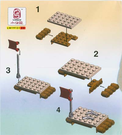
These are instructions for building a smal Lego set.  It utilizes Top-Down visual processing because "visual queries are processed both rapidly and correctly" in this display.  (WARE, Visual Querries)  The queries that this graphic answers are which lego pieces the viewer will need next, how many they will need, and where they will go.  It also shows in what order to place the pieces.  The design is very simple and easy to fallow which means the viewers' queries are answered rapidly and accurately.  By indicating what piece the  viewer will need next they will know what color and shape to look for which will enhance the awareness of the receptors that pic up on that color and shape.