Thursday, December 8, 2011

Visual Techniques

Balance
Regularity
Unity
Predictability
Stasis
Bold
Episodicity
Sequentiality


Asymmetry
Simplicity
Subtlety 
Accuracy 
Singularity 


The first ad is for the iPod nano.  It uses bright bold colors to attract attention while simultaneously using those colors to communicate what color the iPods are available in.  The ad using sequentiality with the colors by arranging them into a rainbow.  The paint dripping down from the iPods makes the colors pop out even more, creating a sense of loudness and fun which are appropriate in trying to sell music players.

The Second ad is for the Mac Book Air.  It is a very subtle ad because it is mostly black with a bit of grey.  The laptop is shown from the side to demonstrate how thin it is which goes with the subtle theme of the ad.  The point of the ad is to emphasize how thin the laptop is and this is done well with the black background which makes the thin strip of light grey stand out.  This ad creates a much calmer and quieter feeling than the ad for the iPods by only displaying one of the product and having a much more subdued color scheme.

Thursday, December 1, 2011

Contrast

Good Use of Contrast

http://farm4.static.flickr.com/3054/2575279443_d5ed4043d6.jpg

The above photo is of a row of ad posters for iPods in a BART station.  These ads use contrast very effectively in a couple different ways.  The first use of contrast is with the bright colors on the posters that make them stand out from the dull brows and whites of the station.  This contrast grabs the attention of passengers on the plantform and making the ad more effective in selling iPods.  Second, the posters themselves are very simple in design.  They each only use two colors and the only element of the posters with detail are the white iPods which contrasts with the bright colors of the poster, making it very clear what they are selling.  


Poor Use of Contrast

http://www.directionsmag.com/images/newsletter/2007/01_18/HIV_Map_lg.jpg

The above map is intended to illustrate the number of people living with HIV in europe by the millions.  The yellow to orange colored areas represent lower numbers while the pink and purple areas represent higher numbers.  While the information this map offers is useful, it is difficult to read due to low contrast between some of the colors, particularly the pink and purples.  Iceland and the Ukraine are two different pinks but it is difficult to tell, especially since iceland is surrounded by light blue and the Ukraine is surrounded by purple.  The light blue and purple make the two different pinks look the same.  Due to this poor use of contrast, someone trying to gather information from this map may end up misreading it because they can not easily tell the difference between the similar colors.  

Thursday, November 17, 2011

Movement and Motion

http://portalkh.files.wordpress.com/2010/08/shipalso.jpg

The Image above is from a part of the video game Kingdom Hearts, where players have to navigate a ship through a 3D environment while dodging obstacles and shooting enemies.  The rout the ship must take from the beginning of the level to the end of the level is a strate line but the 3D obstacles and enemy ships that the player must dodge means that the player needs to be able to move all over the path.  This presented a challenge to the designers of the level because they had to decide how to allow the player to navigate vertically and horizontally through the space as well as forward, without getting disoriented and losing track of where the path is.  In order to solve this problem, the game designers made it so the game camera never moves.  It always stays in the center of the path and everything the ship flies towards simply looks like it is al moving backwards.  while the camera stays in place, the ship is free to move horizontally and vertically on the screen, allowing it to dodge the obstacles that are flying towards the camera and the ship.  The motions of all the obstacles moving toward the camera gives the illusion that the ship and camera are flying forward through space.  

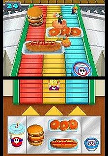
http://upload.wikimedia.org/wikipedia/en/thumb/e/eb/MarioPArtyDS.jpg/220px-MarioPArtyDS.jpg

This is a screen shot of a mini game from Mario Party DS.  In this game, the player's character is on a conveyer belt that is moving towards the camera.  The conveyer belt is covered in food that act as obstacles that players must run around.  If a player does not successfully get around an obstacle, they will fall off the end of the belt and lose the game.  This game is very similar to the game addressed above however simply letting the character move left and right would not work here.  They players would not have enough time to navigate around some of the bigger obstacles if they were confined to a set depth away from the camera like the ship is.  To solve this problem, the game designers allow the player to move there characters forward and backward through space rather than just left and right or up and down.  This allows the players to move father away from the edge of the conveyer belt, which gives them more time to successfully dodge the obstacles and eventually wint the game.


Thursday, November 10, 2011

Dimension, Depth, Space, and Scale

http://awesims.sixty-ten.net/wp-content/50shouse-exterior-driveway.jpg

The image above is of a house that was designed using the computer game, The Sims 3.  In this 3D game, players can create avatars and houses for them to live in.  In order to make the design process easier, the game uses a lot of visual cues to communicate depth and dimension within this world.  In this image we see the house in a 2 point perspective.  We also see shading, particularly on the house and plants to help us define where the light is coming from.  We can also see Atmospheric perspective on the hills behind the house, which helps illustrate that they are far away.  It is easy to tell that the white house in the background is pretty far away as well because we can campare its relative size to the familiar size of the green house.  We can also tell what is closer and father away from us by looking at the overlap of some objects, for example, the bush with the orange flowers is the closest object to us because it overlaps the house and other plants, and is not overlapped by anything its self.  

Thursday, November 3, 2011

Color and Tone

In the PlayStation 2 vido game, Kingdom Hearts, Color and tone are used throughout the game to create stunning environments that were inspired by a number of Disney movies and cartoons.

Tone


The video above is game footage of the level that took place in the world of Steamboat Willy.  The level was done in all black and white, just as the old Steamboat Willy cartoons were.  In the creation of this game level, tone was much more crucial in visually communicating what was going on because it had to communicate that the characters were in a three dimensional environment, while the animation of the old cartoons only had to display two dimensional environments.  The animation has very high tonal and dynamic ranges which help define the three dimensions more clearly.  The old cartoons actually had lower tonal ranges which made them look much simpler.  

In this three dimensional environment, there are hardly any textures used. Everything from the water to the trees looks as though it has a completely smooth surface.  If the game had higher dynamic range, more texture and detail could have been added to the level, however it would not have fit in as well with the Steamboat Willy theme, since the old cartoons were very lacking in detailed textures.  


Color


Kingdom hearts takes place in one of the most vibrantly colored video game worlds.  This is partially do to the fact that they are trying to create a world in which they can incorporate many styles of disney animation.  If the game colors were really saturated, some colorful worlds like Beauty and the Beast's world would not look right.  

As you move your character around the game world, color helps define objects and lighting within the 3 dimensional world.  Smooth gradients help illustrate the presence of light on rounded shapes like spheres and cylinders, giving the game a very defined 3 dimensional environment.  

Thursday, October 27, 2011

Video Game User Interface Design

The Line


This is the world map for the video game Grand Theft Auto IV.  This map is frequently accessed by players and is easily accessible from the main menue of the game.  While the information the map is conveying is rather complex, the map has been simplified down to lines that connect important points (represented by dots) to each other.  Similar to real world maps, thicker lines represent high traffic streets while thinner lines represent less busy streets.  Lines were used in the design precess of this display to build up the map and remain as part of the final presentation.  


Texture


Texture is used all the time in video game menues to help bring out the themes of the game.  The above image is the menu of a list of songs from Guitar Hero II that players can choose to play.  The background is given the texture of a wrinkled piece of binder paper and the text of the menu looks as though it were written by hand.  This was done to make the players feel as though they are looking at a set list.  A set list is the list of songs on a piece of paper that a band is going to play at a show or concert.  This paper textured menue helps create the feeling of being on stage at a concert for the players which is pretty much the entire goal of the game.


The Dot


Dots are the most basic one dimensional unit of construction.  The pixel is the digital equivalent to the dot and is seen in all the old video games.  Unlike dots which are round, pixels are tine bits of square light and color that when organized properly can come together to form digital pictures such as the above screen shot of the classic game Super Mario Brothers.  Pixels are still used in vido game graphics today as well as in all forms of digital media however, they have become smaller and more concentrated, creating smoother and more detailed images.  


Thursday, October 20, 2011

Visual Thinking Research


For my visual research I picked two games to play with my mom off of http://www.puzzles.com/PuzzlePlayground/Visual.htm


The first game we played was The Cat.  In this game we simply had to count up all the triangles in the picture of the cat.  

My strategy was to simply count all the obvious triangles starting with the most complicated area of the cat, the tail, and them moving to simpler areas like the body.  I then went back over the more complicated areas and started counting off triangels made by combining more than one triangle.  

My mom's strategy (seen on the right hand side) involved starting at the top of the cat and working her way down to the tail.  She did not realize at first that multiple triangles could be combined to form bigger triangles but once she figured that out, she was only able to find the ones in the tail. 

 We both missed the 4 extra ones that made up the eyes.  Since we were both looking for triangles, we were both using pattern seeking.  It was easy to find the triangles with obvious contours but building up triangles from shapes with separate contours like in the tail and eyes was a bit more difficult.  


The second game we played was called Five Routs in which we had to get the little men to their respective houses without any of their paths crossing. 

I quickly realized this game was much harder than it looked.  At first it though I would move each man one square at a time so that i would be able to foresee when their paths would cross.  This strategy did not work out because it was impossible to get them anywhere without a fully formed plan.  I decided to work with one man at a time and just try not to cross between other men and their houses.  This strategy only worked for 4 out of 5 of the men.  I simply could not figure out how to get person A to his house.

My mom's approach (seen on the right) was to use as few tiles as possible while not crossing between other men and their houses.  It took her a couple attempts to get 4 our of 5 of the men to their houses.  

While trying to figure out the proper paths for the men to take, we both utalized visual reasoning.  Visual logic told us that direct paths to the houses would cause the routs to cross so we therefore had to figure out which squares would get one man to his house while not cutting off another man from getting to his house.